WooCommerce Checkout Page, Why Customize?
Reasons to customize your checkout page is to convert sales. You want to give your customers a checkout experience that is both informational and flows to a completion. This side by side layout is a good solution. It allows the customer see more without scrolling down the page. You can customize and style it as needed and best of all the code and methods here are free, if I helped you and want to show appreciation leave a little something via the coffee fund it keeps the site going! First lets take a look at the layout, screen shot below;
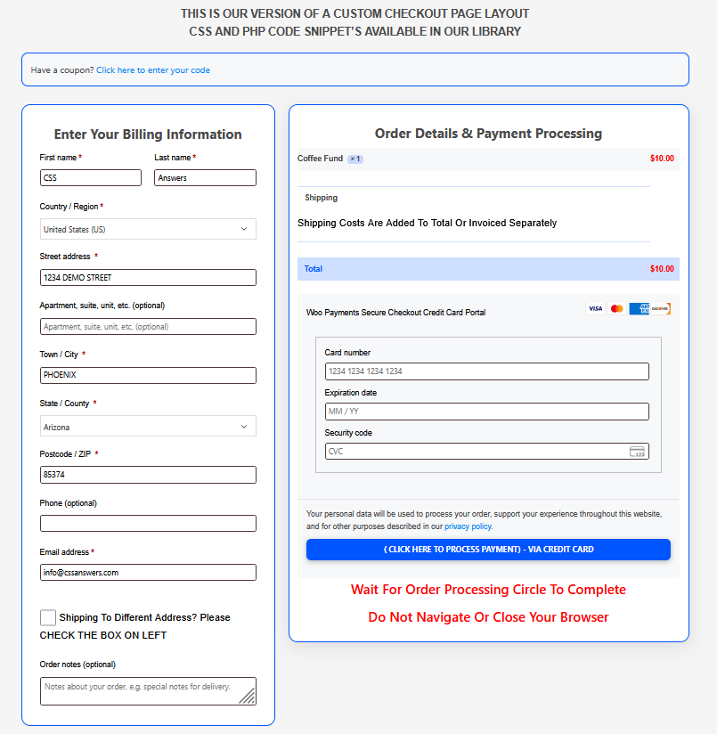
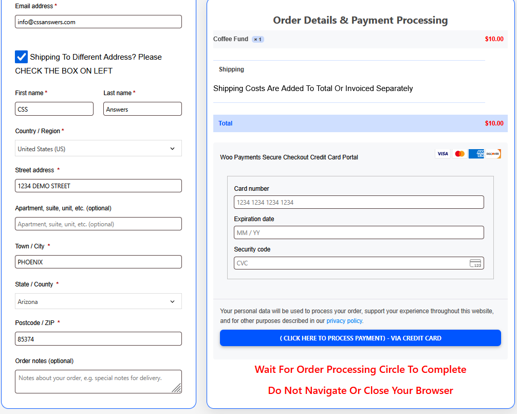
The right side of the checkout: “Order Details & Payment Processing” is a sticky section that travels downward as a customer fills in the billing information on the left side section. If a customer checks the “Shipping To Different Address” box the left side expands downward and the right side will travel downward with the left side. This will keep the customer engaged in the process and result in a higher conversion rate. You can see this in the image below;
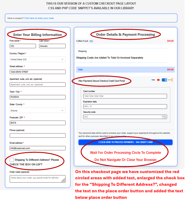
We have also added some additional features or changes utilizing some PHP code snippets. All these are available in the Snippet Library for use. See image below;
.
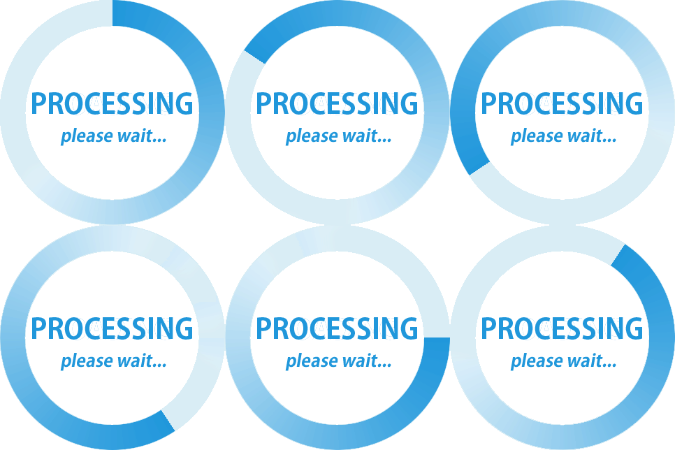
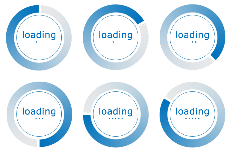
In addition to the checkout page we also adjust the the location of the processing circle to the place order button area-this allows customers to see it after they click the place order button. We also replace it with a larger animated gif image. A stand alone Snippet is in the library. Below are just some of the gif images available online. Feel free to copy any image below for use , make your own or find others online.


![]()